Ergonomic Evaluation of DoorDash's app using Jakob Nielson's 10 Usability Heuristics
- Nhu Ngo
- Jan 15, 2021
- 2 min read

Updated: Jul 24, 2023


Heuristic Evaluation Report:
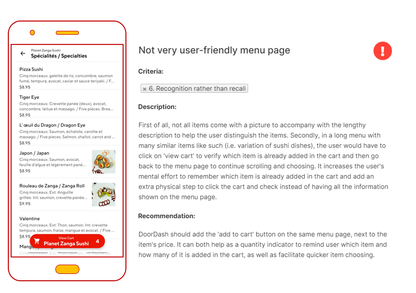
Overall, Door Dash is a functional food delivery app that adheres mostly to the norms for food delivery app out there. Nevertheless, there are still room for improvemements and even if it's functional without it, I believe it can do a much better job in providing a better user experience if it puts in the efforts to make the task flow more user-friendly, especially at the menu page.
2. Insights:
From this app critique exercise, I learned to look at things from a more critical standpoint. Before when I was using Door Dash, there were indeed some good element designs that are common to food ordering app, but after learning about the usability heuristic principles, I realise that no app is perfect, even the one that has million of users.
In addition to the 3 issues stated above, I was frustrated with a few more user-unfriendly features such as the endless scroll of all the restaurants on the main home page without the button to go back to the top of the page, or the fact that the name of some of the dishes are displayed in both French and English but the font size was too big compared to the available real estate so I couldn’t see the whole name in full, then there was also a spelling mistake in a message which deems the app less professional than what I expected. Besides working on improving the points listed above, I believe Door Dash will appear more competitive if it invests in being more personalised and relatable with the user, for instance by leverage the time of the day user accessed the app and just adding a simple ‘good morning, afternoon, evening’ ‘Our breakfast/brunch/dinner recommendation for you’ instead of impartial heading title like ‘late night craving’ could foster the connection.
I found that Door Dash needs to step up its game in delivering a more streamlined and hassle-free user experience, to be able to compete with other popular apps like Skip the dishes or FanTuan/UberEATS who also has more functions in the same app (grocery delivery); and to continue satisfying the user and keep them subscribe to the app (or justify the continuation/start of subscription instead of being a mere one-timer app that drawn in users with first time coupon/delivery fee off).
I am aware that these are merely my personal observations and perceived pain points, by no means their magnitude would be the same for other users. To justify whether changes need to be implemented to improve the app, further usability testing would be required. As an aspiring UX researcher, I also learn to appreciate the effort and the work that the UX researcher/designer of the company put into creating the user interface for us, the people.


Comments